9 Project
Introduction
The data we’re going to work with comes from a yeast microarray experiment (Brauer, 2008) where the authors measured gene expression in 36 chemostat cultures where growth was limited by one of six nutrients (glucose, ammonium, sulfate, phosphate, uracil, or leucine) at 6 different growth rates.
The R world is full of niche tools designed for a specific problem or data type. This is particularly true for Bioconductor and genomics analysis. RNA-seq is a good example where all data import, analysis, and even plotting is done with custom packages and functions designed for gene expression data. Analysis of microbiome data with phyloseq is another example. Now this is not a bad thing and can enable simple, rapid analysis. Yet the point of learning a programming language like R is so you can take back control of your analysis and put the tools to work for your specific problem.
For this project we’re going to take some genomic data and analyze it with the tools that we’ve been learning. The take-away from this project to make the tools work for you instead of you working for them. Data, genomic or not, is still data and we can use the tools available to us in R to gain valuable insights.
Task 1: Data import and examination
The first task of almost all analysis is to get the data into R and spend a little time understanding it’s structure. Although you may be tempted to rush into an analysis it pays to take a bit of time to understand what you are working with and do some cleaning before you dive in too deep. This is important help you avoid costly mistakes and wasted time downstream.
The data file you’ll be using is Brauer2008_DataSet1.csv and although it is pre-processed it will still need some work to get it ready to use.
Your goal is get the data loaded into R and answer the following questions:
- How many rows and columns are there?
- What do the rows and columns represent?
- On first glimpse do the column datatypes look correct?
- What about column names?
- Is this data tidy? Why or why not?
As you look through the data start thinking about what steps you’ll need to get it into a workable state.
2. What do the rows and columns represent?
Rows are genes and columns are a mix of different variables including gene names and expression values.
3. On first glimpse do the column datatypes look correct?
Yes, it seems that R has guessed correctly on what the values should be.
4. What about column names?
The columns that have the gene expression values don’t look right. Something is up with that period in there.
5. Is this data tidy? Why or why not?
It’s not. Each observation does not form a row and each variable does not form a column.
Task 2: Data Tidying
Never underestimate the amount of time and effort it will take to tame a wild dataset into something usable. Even if someone has already processed and “cleaned” the data before you (such as our current dataset) it is likely that you will need to spend some time fiddling with it for your particular needs (or for a particular function you want to use).
You’ve learned about the tidy data concepts, now it’s time to put them into practice. The first and most important step is decide what, if any tidying needs to be done. Recall that:
- Each variable forms a column.
- Each observation forms a row.
- Each type of observational unit forms a table.
Questions to answer:
- Which column contains multiple variables? Split it up so each column represents a single variable. (Hint: for the
separgument, usesep = "\\|\\|". But think about why!) - The
GWEIGHT,GID, andYORFcolumns we also won’t need so you can get rid of those. - Is this data in long format? How can you fix that?
- Do you have any columns that have multiple variables? Be sure to fix any before you move on.
Try to code all the cleaning steps as a single pipeline. Remember the separate() and gather() functions from the tidyr package.
Bonus: Your cleaning steps may have left some variables with extra white space at the end. Hint: Using mutate_at() with the str_trim option, see if you can clean these up.
Task 2 Solution
1. Which column contains multiple variables? Split it up so each column represents a single variable.
We need to tell separate() to split on the || character using the sep argument. However, the | character is actually a special character for something called regular expressions, which we don’t need to worry about right now. That’s why we need to use the double backslash, which “escapes” the | character and tells separate() to interpret it like a normal character. If we used sep = "||" this would give us the wrong result.
2. The GWEIGHT, GID, and YORF columns we also won’t need so you can get rid of those.
That’s easy with select().
clean <- raw %>%
separate(NAME, c("gene_name", "BP", "MP", "gene_id", "number"), sep = "\\|\\|") %>%
select(-GWEIGHT, -GID, -YORF)3. What’s wrong with the column names? How can you fix that?
They’re variables not names and tidy data principles tell us that each variable should be a column. And these are not just not just 1 variable - both nutrient and growth rate are present. We can fix this with gather().
clean <- raw %>%
  separate(NAME, c("gene_name", "BP", "MP", "gene_id", "number"), sep = "\\|\\|") %>%
select(-GWEIGHT, -GID, -YORF) %>%
gather(variable, expression, G0.05:U0.3)4. Check again: do you have any columns that have multipe variables? Be sure to fix any before you move on.
Why yes, it seems that our variable column is comprised of both nutrient and growth rate. We’ll have to use separate() again. The trick here is how to specify the correct place to split the variable. We want the first letter in one column (nutrient) and the the remaining part in a second column (growth_rate). If you read the help for the separate() function you’ll see that if you provide a number to the sep argument it will split at this position. This works great for us. There are other ways to split this variable, however, these require a bit more knowledge of regular expressions. And always go with the simplist soluion you can find.
clean <- raw %>%
  separate(NAME, c("gene_name", "BP", "MP", "gene_id", "number"), sep = "\\|\\|") %>%
  select(-GWEIGHT, -GID, -YORF) %>%
gather(variable, expression, G0.05:U0.3) %>%
separate(variable, c("nutrient", "growth_rate"), sep = 1)## [1] " ER to Golgi transport " " biological process unknown "
## [3] " proteolysis and peptidolysis " " mRNA polyadenylylation* "
## [5] " vesicle fusion* " " biological process unknown "Bonus
clean <- raw %>%
  separate(NAME, c("gene_name", "BP", "MP", "gene_id", "number"), sep = "\\|\\|") %>%
  select(-GWEIGHT, -GID, -YORF) %>%
  gather(variable, expression, G0.05:U0.3) %>%
  separate(variable, c("nutrient", "growth_rate"), sep = 1, convert = TRUE) %>%
  mutate_at(vars(gene_name:gene_id), str_trim)
head(clean)
## gene_name BP MP gene_id
## 1 SFB2 ER to Golgi transport molecular function unknown YNL049C
## 2 biological process unknown molecular function unknown YNL095C
## 3 QRI7 proteolysis and peptidolysis metalloendopeptidase activity YDL104C
## 4 CFT2 mRNA polyadenylylation* RNA binding YLR115W
## 5 SSO2 vesicle fusion* t-SNARE activity YMR183C
## 6 PSP2 biological process unknown molecular function unknown YML017W
## number nutrient growth_rate expression
## 1 1082129 G 0.05 -0.24
## 2 1086222 G 0.05 0.28
## 3 1085955 G 0.05 -0.02
## 4 1081958 G 0.05 -0.33
## 5 1081214 G 0.05 0.05
## 6 1083036 G 0.05 -0.69Task 3: Plots
Whew! Alright, that’s done, but now you might asking why spend all that time cleaning up the data. Hopefully you should be able to answer that question by now but moving on to making some plots will help make it even more clear.
In a typical analysis you wouldn’t necessarily know which gene(s) to start looking at and would want to start with some more exploratory analysis. However, to practice our plotting and analysis let’s focus on a few pre-picked genes and pathways.
- Filter your now cleaned data to contain only the gene LEU1.
- Make a plot of the expression of this gene at various growth rates. Use colour to distinguish the different nutrients.
- What are some conclusions you can make from this data?
- What biological process is LEU1 classified as?
- Filter your cleaned data for all genes that are in the same biological process as LEU!.
- Make a plot of these genes, the same as you had for LEU1 but faceted by gene.
- Do any of the other genes follow the same pattern as LEU1?
- Customize your plot a bit by changing the colour palette to one of the RColorBrewer palettes. Explore some of the other themes available (
theme_bw()is particularly nice). Fix the x-axis and y-axis labels so they look nicer.
Bonus: To increase readability of the plot it can helpful to change those nutrients from letters to full words. Although there are ways to do this directly in ggplot the easiest is to change it in the original data.
Task 3 Solution
1. Filter your now cleaned data to contain only the gene LEU1.
2. Make a plot of the expression of this gene at various growth rates. Use colour to distinguish the different nutrients.
clean %>%
  filter(gene_name == "LEU1") %>%
  ggplot(aes(x = growth_rate, y = expression)) +
    geom_line(aes(colour = nutrient))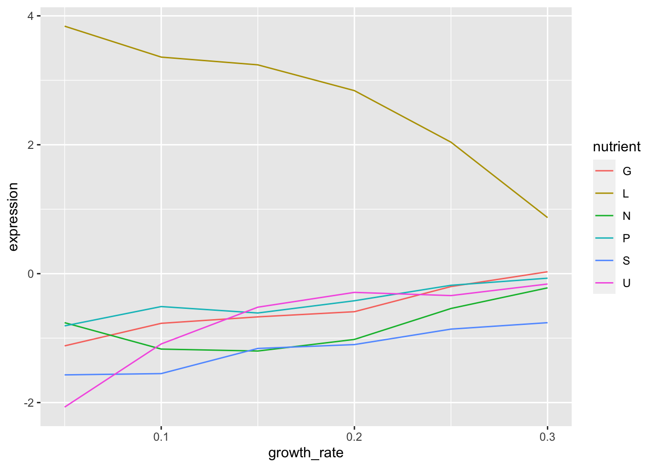
3. What are some conclusions you can make from this data?
- When leucine is limiting the expression of LEU1 is higher than when any of the other nutrients are limiting.
- As growth rate increase the expresison of LEU1 decreases but only in leucine limiting conditions. In all other conditions it increases as growth rate increases.
4. What biological process is LEU1 classified as?
leucine biosynthesis
5. Filter your cleaned data for all genes that are in the same biological process as LEU1.
6. Make a plot of these genes, the same as you had for LEU1 but faceted by gene.
clean %>%
  filter(BP == "leucine biosynthesis") %>%
  ggplot(aes(x = growth_rate, y = expression)) +
    geom_line(aes(colour = nutrient)) +
    facet_wrap(~gene_name)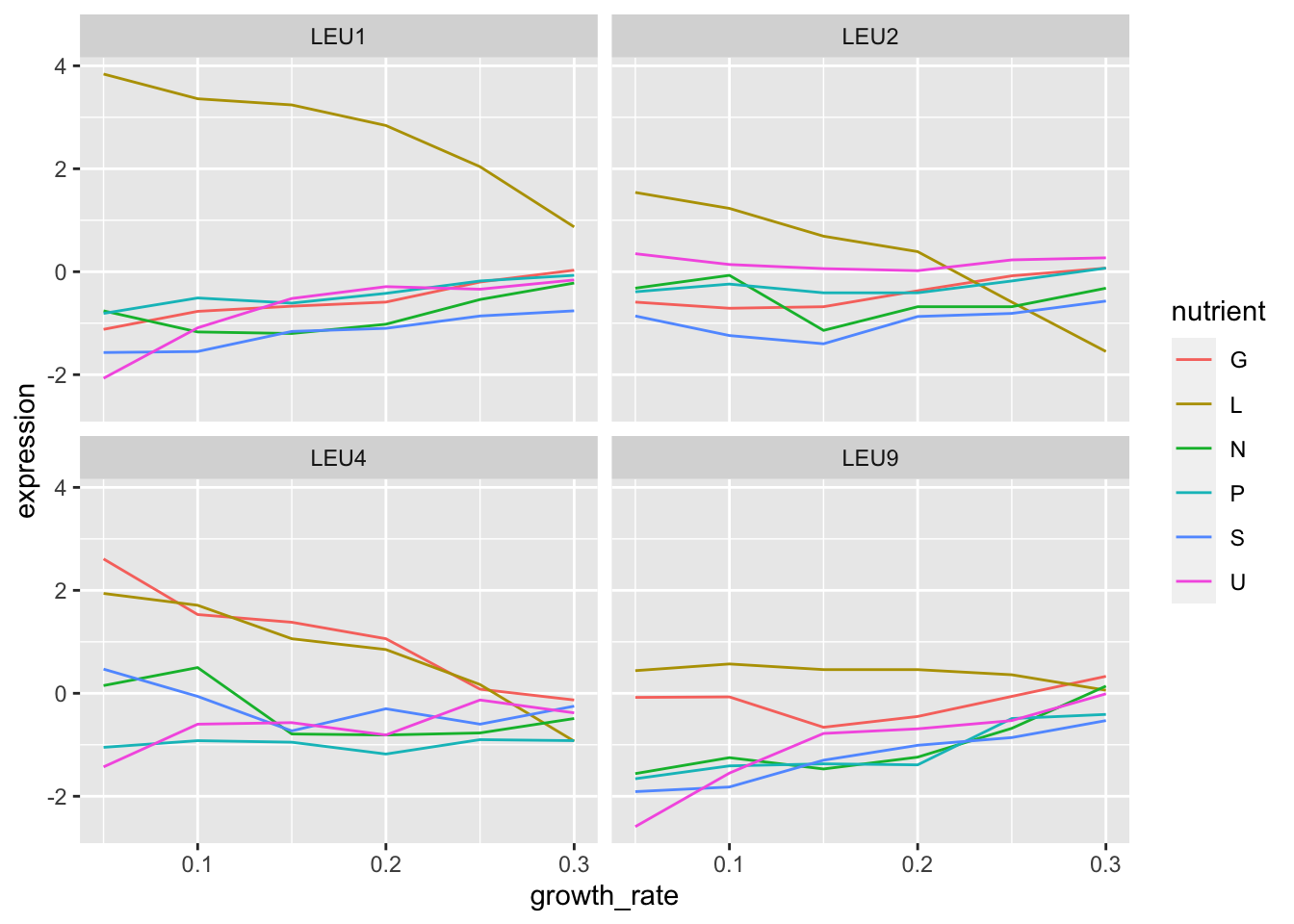
7. Do any of the other genes follow the same pattern as LEU1?
LEU2 seems to but the expression difference in leucine limiting conditions is not quite so high.
8. Make it pretty
clean %>%
  filter(BP == "leucine biosynthesis") %>%
  ggplot(aes(x = growth_rate, y = expression, colour = nutrient)) +
    geom_line() +
    geom_point() +
    facet_wrap(~gene_name) +
    scale_color_brewer("Nutrient", palette = "Accent") +
    theme_bw() +
    labs(x = "Growth Rate", y = "Expression (log2)") +
    theme(strip.background = element_blank())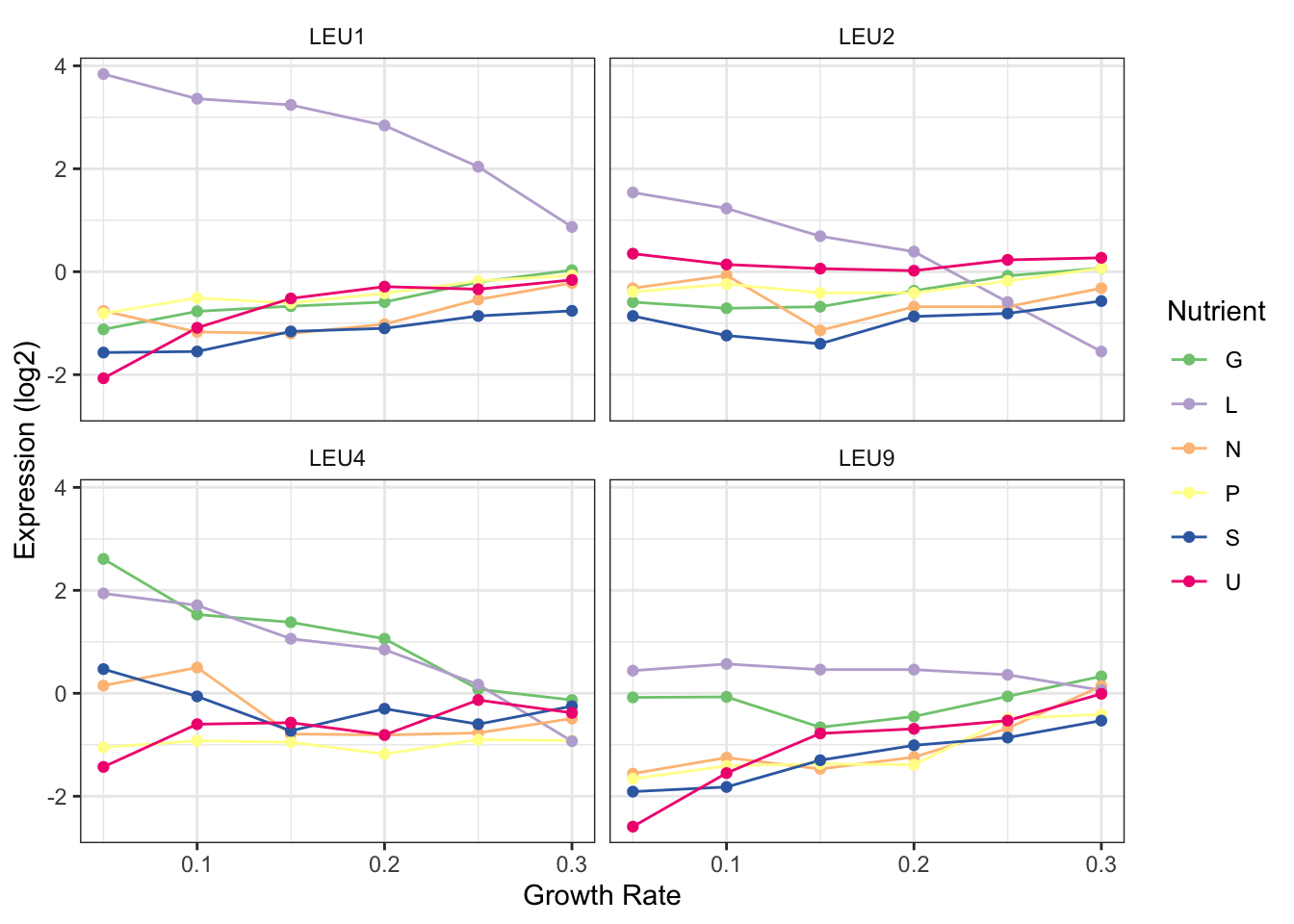
Bonus: Changing nutrient names
nutrient_key = c(
  G = "Glucose",
  N = "Ammonium",
  P = "Phosphate",
  S = "Sulfate",
  U = "Uracil",
  L = "Leucine"
)
nutrient_key["P"]
## P
## "Phosphate"clean %>%
mutate(nutrient_names = nutrient_key[nutrient]) %>%
filter(BP == "leucine biosynthesis") %>%
ggplot(aes(x = growth_rate, y = expression, colour = nutrient_names)) +
geom_line() +
geom_point() +
facet_wrap(~gene_name) +
scale_color_brewer("Nutrient", palette = "Accent") +
theme_bw() +
labs(x = "Growth Rate", y = "Expression (log2)") +
theme(strip.background = element_blank())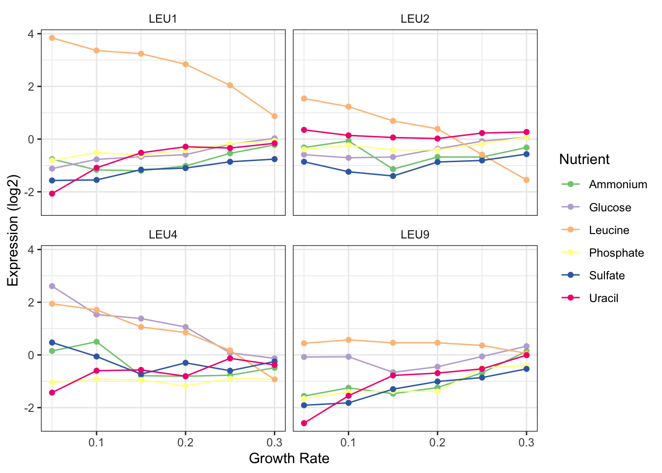
Task 4: Heatmap
Heatmaps are quite popular but generally useless visualisations used frequently in the genomic sciences. They can show a large amount of information in a small space, however, this very feature often renders them useless in terms of interpretability. Yet, for some applications they can be useful and let’s face it, your supervisor propbably wants one so it’s a good skill to have.
Heatmaps are very straight forward to make with ggplot using geom_tile() however, one of the more useful features of heatmap is the row and column ordering usually done with hierarchical clustering. This is non-trivial (but not impossible) to implement with ggplot so instead we’re going to look at a package specifically designed for these types of heatmaps. There are as many heatmap packages for R as there are heatmaps and you may end up using different packages for different purposes. However, the pheatmap package has a nice balance of features, speed, and ease of use and is the one we’ll work with today, although you are free to look at others for your own needs.
To this point much of your training has focused on the concepts of tidy data analysis, which are very powerful and you will come to rely on for much of your work. However, for genomics and other bioinformatics analysis you will often find yourself having to go between the tidyverse and other custom formats and datatypes specific to another package or the more traditional R datatypes, particularly the matrix format. In addition to learning how to make a nice heatmap the other main goal of this task is to help you become familar with moving back and forth between different data structures.
Questions to answer:
- Start by installing the
pheatmappackage from CRAN. Have a look at the help page for thepheatmap()function. Which argument specifies the data? What format does it need? - Using what you learned from the help function get the gene expression data into a format that
pheatmap()can use. Think about what you want your heatmap to look like - what are the columns and rows? - Once you’ve got data in the correct format start by making a simple heatmap with default parameters. Do you like it? Is there anything wrong with it? What would change from a data interpretation perspective? What about from aethetics perspective?
Task 4 Solution
1. Start by installing the pheatmap package from CRAN. Have a look at the help page for the pheatamp() function. Which argument specifies the data? What format does it need?
Looks like pheatmap() needs a numeric matix given with the mat arguments, which is the first and only required arugment.
2. Using what you learned from the help function get the gene expression data into a format that pheatmap() can use. Think about what you want your heatmap to look like - what are the columns and rows?
Here we’re going to go back to our pre-tidied data. This doesn’t negate the work we did to tidy it nor does it mean the the data is now ‘dirty’ or bad somehow. Tidy data is standardized but many R tools still don’t work with data in this format and so we must adapt.
## [1] "matrix" "array"## [1] "double"3. Once you’ve got data in the correct format start by making a simple heatmap with default parameters. Do you like it? Is there anything wrong with it? What would change from a data interpretation perspective? What about from aethetics perspective?
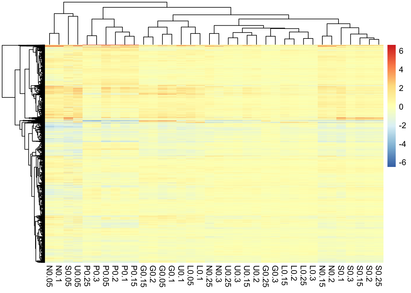
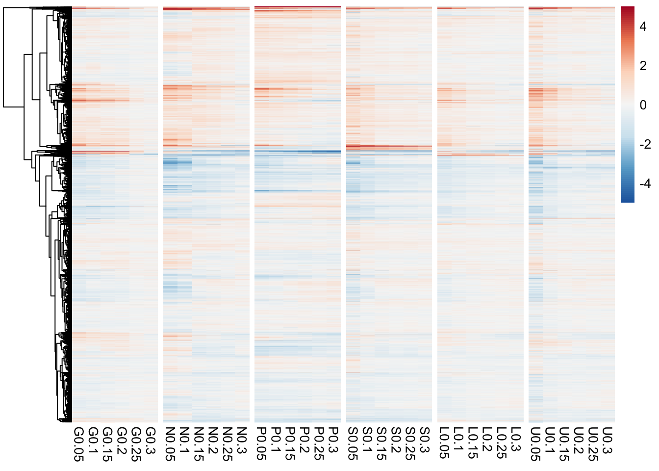
Overall this actually looks pretty good. Because these data have already been normalized and scaled we don’t need to do much here but there are few tweaks that may help.
- The default is to order both the rows and columns, however, because this is a timecourse experiment we may not want to order the columns. In fact if we look at the raw data we see that the columns are already ordered by time.
- The colours are better than the typical red/green (which you should NEVER use, BTW) but still leave something to be desired. This could be changed in a final version of the plot. Note that we have a diverging colour scale with values ranging from -6 to +6. This is becuase these data are mean-centred. Blue (negative) values are below the mean for that gene and red values (positive) are above the mean for that gene. Yellow is the mean expression for that gene. Mean-centering is a handy way to show fold-changes, but should always be displayed with a diverging colour scale.
- To help with visualizing the different nutrients, we can add gaps to the heatmap to make a column for each nutrient.
library(RColorBrewer)
pheatmap(hm_mat,
         cluster_cols = FALSE,
         color = colorRampPalette(rev(brewer.pal(n = 7, name = "RdBu")))(100),
         breaks = seq(-5, 5, length.out = 101),
         gaps_col = c(6,12,18,24,30)
)